|
|
Post by TV Eye on Dec 1, 2008 20:57:35 GMT -5
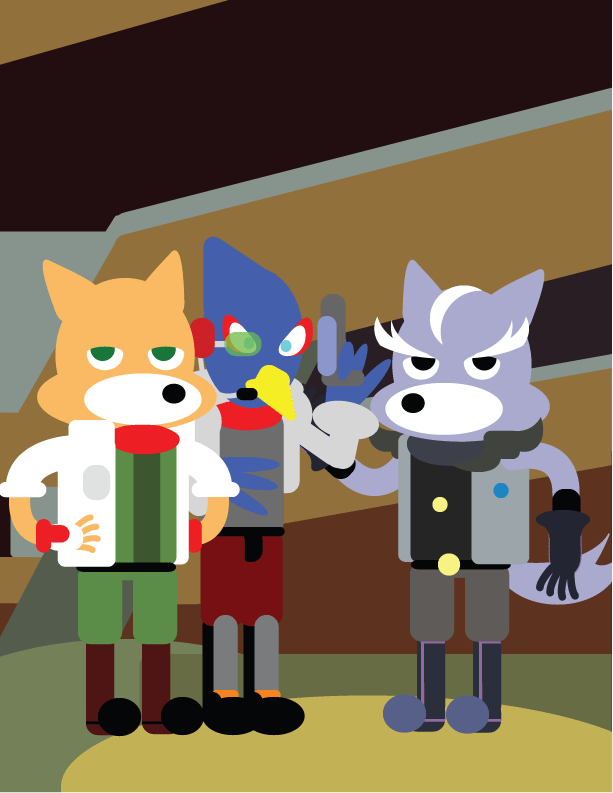
I'm pretty sure Sakurai did the same thing  |
|
|
|
Post by TV Eye on Dec 2, 2008 17:00:12 GMT -5
New pic!  |
|
|
|
Post by kirbychu on Dec 2, 2008 18:29:00 GMT -5
Haha, I love it! Strangely adorable, and adorably strange. ;D
|
|
BeamClaws
Balloon Fighter
  Beam claws closes the gap with his excellent foot speed!
Posts: 934
|
Post by BeamClaws on Dec 2, 2008 19:54:48 GMT -5
SNES style isn't it? Look at the background! That HAS to be SNES!
|
|
Kohta
Muddy Mole
  Blue. Mmm, blue.
Posts: 651
|
Post by Kohta on Dec 3, 2008 7:14:45 GMT -5
I love you Teev!  |
|
|
|
Post by TV Eye on Dec 3, 2008 12:33:15 GMT -5
I love you Teev!  Heh, I knew you'd like it! |
|
|
|
Post by Spud on Dec 3, 2008 15:44:10 GMT -5
I love you Teev!  Heh, I knew you'd like it!  It looks like they're all at a starbucks or something.  |
|
Kohta
Muddy Mole
  Blue. Mmm, blue.
Posts: 651
|
Post by Kohta on Dec 3, 2008 16:29:41 GMT -5
It looks like they're all at a starbucks or something.   Had to be done ;D |
|
|
|
Post by TV Eye on Dec 3, 2008 17:15:36 GMT -5
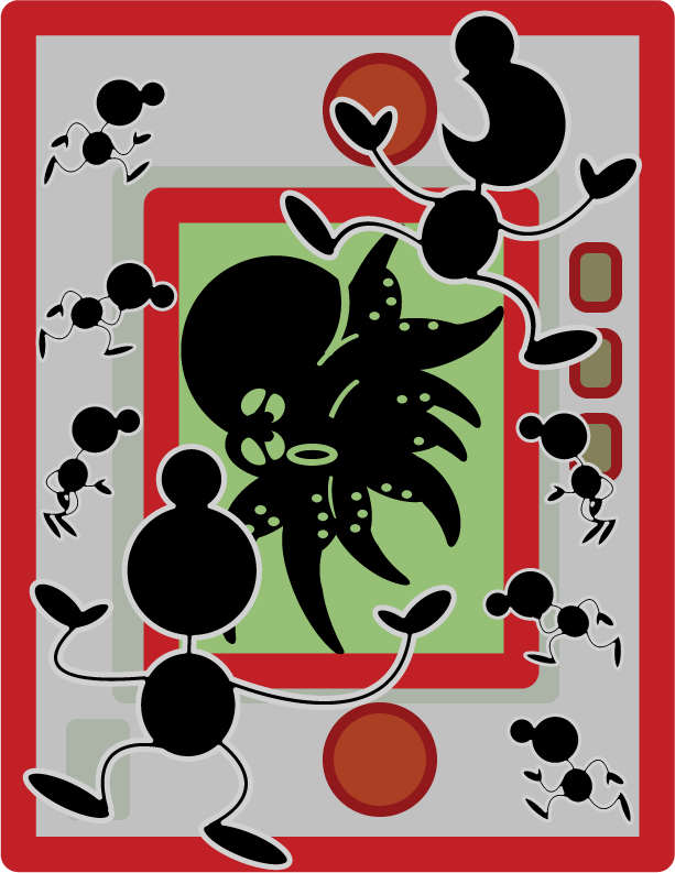
Mr. Game and Watch  |
|
|
|
Post by 8bitretroshit on Dec 3, 2008 17:31:19 GMT -5
These are all awesome as hell. That G&W one would make a great destkop wallpaper were it wider. e: I actually did that moments after I made that post  Looks nifty! VVVVVVVV |
|
BeamClaws
Balloon Fighter
  Beam claws closes the gap with his excellent foot speed!
Posts: 934
|
Post by BeamClaws on Dec 3, 2008 20:24:21 GMT -5
Turn it sideways. Man, that one is awesome.
|
|
|
|
Post by Fryguy64 on Dec 5, 2008 4:21:44 GMT -5
That Game & Watch one is very stylish and cool.
With some of the others, I almost think they would benefit from some extra work to slip some very slight dropshadow in and maybe a bit of a rough paper texture, to make them appear like paper cut-outs. I think that would add a bit of PIZAZZ!
|
|
|
|
Post by TV Eye on Dec 5, 2008 9:14:27 GMT -5
That's a good idea, I'll try it out.
|
|
|
|
Post by TV Eye on Dec 5, 2008 11:16:14 GMT -5
Okay, here is my Pokemon one, but I'll let you guys decide which you like better before I post it on Deviantart. Textured one, or Regular.If more people like the textured one, I'll go back and change my old pictures to be textured. |
|
|
|
Post by Fryguy64 on Dec 5, 2008 11:37:06 GMT -5
Gonna be a pain in the ass and say "a combination of the two". I'm guessing you're working in Photoshop or something? You should be able to reduce the relief of the texture. I think that will prevent the texture from become over-dominant in the image. Are you working in multiple layers as well? What might be an idea is to have different relief values for the characters than you do for the background. Also, consider the slight drop shadow to separate the characters from the background - the ones at the top are fine, but the ones at the bottom kinda blend in with the background. If you want an example of what I'm blathering on about, perhaps you could send me your raw files and I could mock something up? Just a thought  |
|