albert
Pikpik Carrot

Posts: 10
|
Post by albert on Sept 30, 2012 15:50:40 GMT -5
Okay Ironmam is my first assignment  and here she is:  I hope you like it. |
|
jigglysama
Chibi-Robo
 Pokemon Gijinka Fan
Posts: 227
|
Post by jigglysama on Sept 30, 2012 20:20:37 GMT -5
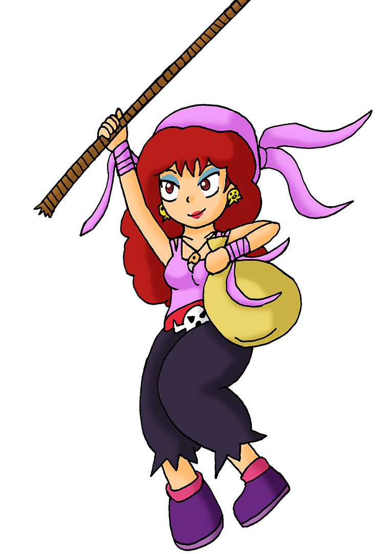
Wow albert, that was really... fast? Still looks really nice! Anyway, I am also done with my Captain Syrup pic.  So it looks like that's all for me at the moment. Good luck to everybody with their entries. This collab looks very promising! |
|
|
|
Post by Wildcat on Sept 30, 2012 20:24:03 GMT -5
That's perfect! Your next one is any female Pokemon trainer you feel like tackling, albert.  Jigglysama - I'll be devising a third-party roster over the next few days to keep those who have made their way through the three Nintendo characters so quickly involved, so check back soon, all right? Your Syrup is the best one you've done for this, I'd say.  |
|
albert
Pikpik Carrot

Posts: 10
|
Post by albert on Oct 1, 2012 1:29:44 GMT -5
Thanks  . So I picked Leaf the counterpart of Red. And I completed the drawing just now: but then I realized that I did it too small so I resized it.  but now that the weekend is over I most likely won't be able to finish the 3rd one this fast  . she looks a little blurry because it's resized xD the original I worked on was too small and I noticed too late.  |
|
|
|
Post by Da Robot on Oct 1, 2012 6:11:13 GMT -5
Okay, I have to admit i'm a real noob when it comes to using a digital art software . . .
How big are the canvases you guys are using (like in height/width in pixels, pixel count per inch and overall file size).
Using Corel Painter Essentials 4 and my "Nikki" image is currently 7150 by 2560 pixels and file size 35.6MB (in Riff)
(Other art programs I have a Photoshop Elements 6.0 and just downloaded GIMP 2 today)
PS: I'm liking the art you folks are posting so far, it's nice.
|
|
jigglysama
Chibi-Robo
 Pokemon Gijinka Fan
Posts: 227
|
Post by jigglysama on Oct 1, 2012 6:55:53 GMT -5
Well, the size should not mather too much while doing the picture, just mather of preference. In my case I post a bigger drawing so it will still looks decent at the time it gets resized within the final group gathering.
|
|
|
|
Post by Wildcat on Oct 1, 2012 7:52:23 GMT -5
Aye, I will be resizing them all to fit my needs. So larger is better so I have more wiggle room. I'll be using Paint Shop Pro to make the collab WP.
albert - Nice! The small one is fine. I need to catch up and store all of these later today. XD And lucky you, the wheel of chance landed on Pauline this time. ;D Have fun!
|
|
|
|
Post by Old Man Rupee on Oct 1, 2012 13:51:50 GMT -5
My piece has stalled due to the purchasing of a brand new computer, and the transferral of files (including the half finished drawing) between old and new.
Now I know it's on one of these USBs...
|
|
|
|
Post by TV Eye on Oct 1, 2012 14:11:52 GMT -5
Okay, I have to admit i'm a real noob when it comes to using a digital art software . . . How big are the canvases you guys are using (like in height/width in pixels, pixel count per inch and overall file size). I like to start with a 15x15 in. canvas at 300 dpi. After I get the character drawn, I resize the canvas around the drawing and bring it back down to 72 dpi. |
|
|
|
Post by Fryguy64 on Oct 1, 2012 14:33:36 GMT -5
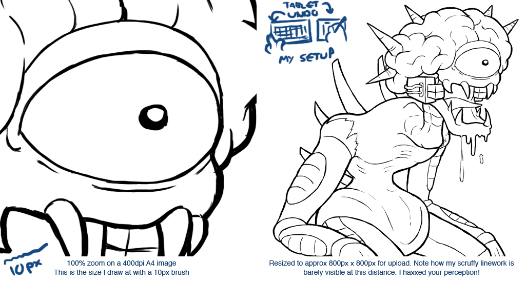
I tend to draw onto an A4 sheet size at 400dpi, sketch using a 30-40pt brush, cleanup sketch with a 20pt brush then drop down to 10pt for the final inking (all with tablet). Then when you resize it's nice and sexy!
|
|
|
|
Post by Fryguy64 on Oct 2, 2012 10:34:29 GMT -5
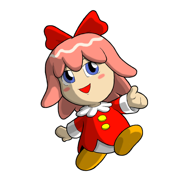
 Ribbon! Ain't she cuuuute! Edit: She does have wings... They're just not visible on the white background  Check at deviantArt |
|
albert
Pikpik Carrot

Posts: 10
|
Post by albert on Oct 2, 2012 11:49:51 GMT -5
I have no idea what the size of my drawing is until I finish the drawing. I usually sketch on paper, scan then finish it on gimp. I tend to forget the size and mostly work on zoom in  but i'll have to keep myself more organized and draw bigger or smaller. BTW Awesome! I get to draw Pauline =D i'm probably going to take longer though since this week will be very busy. Wow Fry Guy Ribbon looks really good! |
|
|
|
Post by Da Robot on Oct 3, 2012 18:38:11 GMT -5
Thanks for the advice folks. And now here's Nikki drawing. It could have been worse. The original size that was going to be uploaded to DA was like 56mb, the one uploaded is 178 kb. Should I have made it smaller? I have to admit I need to practice more in Coral Paint. |
|
|
|
Post by Fryguy64 on Oct 4, 2012 4:53:07 GMT -5
That's... a big ol' image file! Ribbon clocked in at 10MB and Sheema at 16MB (Sheema had extra layers though)... But those are the original 3300 x 4600 pixel image files. Shrinking them down should make the lines more crisp, but that will obviously depend on the size of the brush you used, etc. Hell, it's probably easier if I just made you a pic explaining it.  |
|
|
|
Post by Da Robot on Oct 4, 2012 6:09:35 GMT -5
That's... a big ol' image file! Ribbon clocked in at 10MB and Sheema at 16MB (Sheema had extra layers though)... But those are the original 3300 x 4600 pixel image files. Shrinking them down should make the lines more crisp, but that will obviously depend on the size of the brush you used, etc. (Nice line work by the way) I'm known the whole idea of "work at large image size and than shrink down to make linework look even better and minimize mistakes" from the comic book industry. It's just kind of confusing at first to work with digital on an a image and wonder "is this how everybody else does it or am I doing something wrong?" Well in the end, Nikki ended up better than the crappy Andross I drew last year. |
|