|
|
Post by Koopaul on Jun 14, 2017 16:57:02 GMT -5
I'm starting to notice a trend with Nintendo that I'm not fond of. It started when I saw the menus and icons on the Nintendo Switch itself. Very flat, no colors, no music... Barebones and basic. I figured "Oh well, they'll probably have themes you can download later." Then I played Breath of the Wild and saw how flat, basic, and minimal the menus were. The title sceen has no music. The file select is flat black boxes. Okay look at this: This is the Wind Waker's file select. Very stylistic. 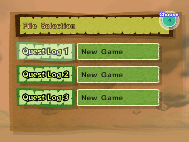 Here's Twilight Princess... very elegant. 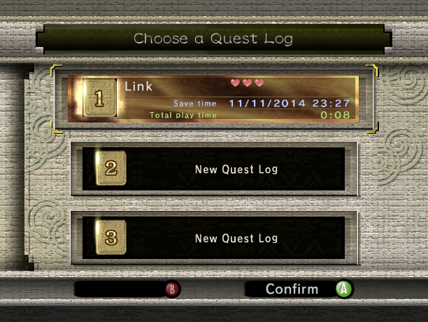 I was used to seeing stuff like this from Nintendo. Why did Breath of the Wild get rid of that? So I thought maybe it was just Breath of the Wild. After all it's just one game. But then I saw footage of Super Mario Odyssey and saw something shocking! This is the HUD in Galaxy 2... 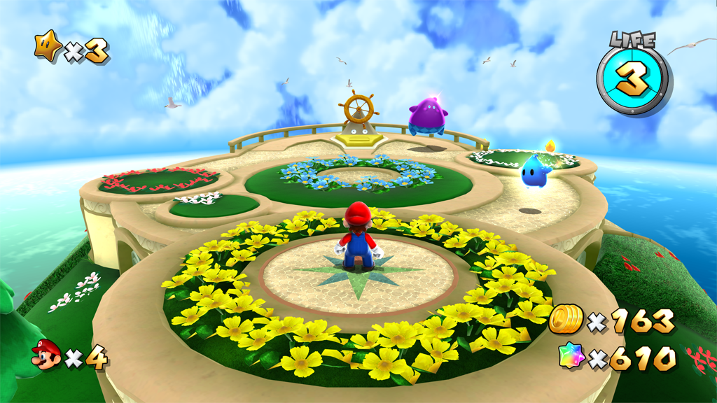 This is the HUD in Odyssey... 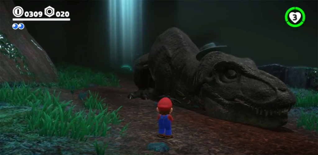 This is what a speech bubble looks like in Galaxy 2... 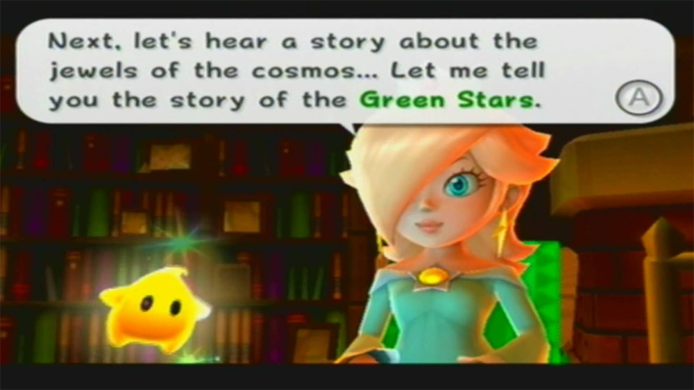 This is what a speech bubble looks like in Odyssey...  And finally this is what it looks like when you get a Star...  And this is what it looks like when you get a Moon...  Yeesh! What happened? Why did Nintendo decide to go bland, flat, and minimalist with UI and HUD? Is this a new thing with them? What do you think? |
|
|
|
Post by nocturnal YL on Jun 16, 2017 11:55:08 GMT -5
Your rant came years too late. I hated it since Windows 8 popularised flat style.
|
|
|
|
Post by Da Robot on Jun 19, 2017 5:42:01 GMT -5
Could just be the a early UI for the E3 build, while the final one hasn't been implemented?
|
|
|
|
Post by Koopaul on Jul 30, 2017 9:22:26 GMT -5
I'm pretty sure this is what we are getting. The minimalist style is the in thing now. But one thing that is really odd that I didn't think of until now... Why are the icons in Odyssey always on the screen?
See in Galaxy (2) the icons disappear from the screen and only appear when you are collecting the appropriate item. Makes sense right? Why does it need to be on the screen at all times? Well in Odyssey it is.
Just another strange thing I noticed.
Also think about this. The flat white colors could be problematic from a gameplay perspective. In a snowy or cloudy world those icons and numbers would barely be noticeable and might blend right into the background. If they had a black outline (like the icons in Galaxy do) they'd be perfectly visible in any situation be it light or dark.
|
|