|
|
Post by Da Robot on Mar 15, 2020 1:48:55 GMT -5
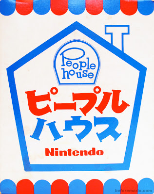
Look at this boxart (and font) for this 1968 Nintendo toy that was their first attempt at making something aimed at a female audience (instead of either boys and girls or just families like previous toys) according to the Before Mario blog While here's Animal Crossing's Japanese box and western logo   While I won't deny that the Japanese font isn't the same the PH Japanese font but for the English text is where the similarities lie. The layout of the letters in both logo has: - Vertical staggering of individual letters so they aren't sitting on the same line - Tilting of letters (including first letting on each line have a slight outwards tilt) - the "o" on the second line is raised up on both logos Now I'm sure if could call this an interesting coincidence or homage to. Another interesting fact that I'm heard about Animal Crossing development was that they wanted a game that would be aimed at female players and then got all the woman in Nintendo (about 20 at the time) to design for it, to appearl to that audience. So another possible homage there of "game aimed at particular audience referencing an earlier toy aimed a particular audience?" The People House toys aren't fully original, Nintendo got the license for these toys for the Japanese market from an American toy and book brand Peepul Pals (made in 1967) by Whitman. The Peepul Pals logo/font appears to be similar to that of the People House font but doesn't use the same layout for the letters as mentioned above (or isn't as exaggerated)  |
|
|
|
Post by nocturnal YL on Mar 15, 2020 6:19:28 GMT -5
The o and l look similar, but the s doesn't match. I wonder…
Is there any way to know if the font is developed in-house? Many games, especially the modern ones, use publicly sold typefaces anyone can license without any modification. But we also know that Nintendo, like most design companies, also make unique fonts as part of their products' identity. Which case is it here?
|
|