|
|
Post by The Qu on Sept 16, 2014 5:31:42 GMT -5
Added custom moves for Luigi, Bowser, Samus, Charizard and Mega Man. Samus' are great.
|
|
|
|
Post by nocturnal YL on Sept 16, 2014 6:14:38 GMT -5
Kirby's charged Side Special being based on Hammer Kirby's Hammer Flip (Up B).
Mega Lucario is a Final Smash. It pushes Lucario's aura to the max. Lucario even says "Aura, maximum!!" (JP) when transforming.
|
|
|
|
Post by kirbychu on Sept 16, 2014 11:49:04 GMT -5
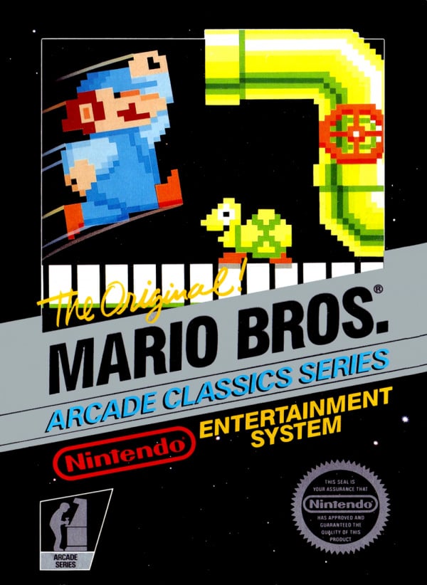
Light blue: Light blue overalls, pink undershirt. Looks like one of Wario's colors for some reason. Hate to dredge up the old theory, but it looks like the cover to NES Mario Bros. The few European covers I can find online look more pink? I know we discredited this idea, but I dunno. This one?  Looks about right to me. |
|
|
|
Post by Manspeed on Sept 16, 2014 13:02:14 GMT -5
That's a horribly washed-out scan, though.
|
|
|
|
Post by kirbychu on Sept 16, 2014 13:13:24 GMT -5
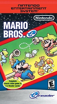
I think that's just how it looks... The colours on the art look about the same on this e-Reader pack scan, but the e-Reader borders and logos don't look washed out.  EDIT: Found another version of it with another slightly different level of saturation. XD It's definitely light blue and pink like that palette though.  |
|
|
|
Post by Manspeed on Sept 16, 2014 13:43:34 GMT -5
The one on the e-Reader pack looks way more red than Mario's Smash Bros. palette, which is pastel pink. I really doubt it's a reference to the Mario Bros. art.
|
|
|
|
Post by kirbychu on Sept 16, 2014 13:59:13 GMT -5
Alright. Well I'm not gonna argue with you. Here's all three colours extracted right from the images, side by side. Make up your own mind.  EDIT: Here's the hat colours compared too. Obviously there's a little margin for error since they're all from scans, but they're all so close it hardly matters.  For the record, I took all these colours from the midtones of each scan. There's barely any difference in hue value between them. Less than 10 degrees at most. There's a bigger difference in saturation with the Smash pink, but that could just be some scans being more washed out than others. The actual colour is the same. Either way his shirt on the Mario Bros. art definitely isn't just showing up pink because of bad scans, 'cause all three of those scans also have a clear and distinct red on them which is definitely not showing as pink. That's way deeper than I wanted to go into this, I could tell the colours were the same at a glance. But I was bored, so there's your proof. I don't think there's any way that's not a reference, it's way too specific. XD |
|
|
|
Post by TV Eye on Sept 19, 2014 20:50:20 GMT -5
For any costumes we might've missed in the other thread, there's this. |
|
|
|
Post by Manspeed on Sept 19, 2014 21:51:19 GMT -5
Hey, this same image that claims the pink/blue costume is a Mario Bros. reference uses an image from Mario Bros. that shows Mario wearing an obvious dark red. What gives? |
|
|
|
Post by kirbychu on Sept 19, 2014 23:00:51 GMT -5
Hey, this same image that claims the pink/blue costume is a Mario Bros. reference uses an image from Mario Bros. that shows Mario wearing an obvious dark red. What gives? Yeah, for some reason most of the cabinet art for the Arcade version has Mario in blue and red, but the art from the NES version has him in light blue and pink. Luigi's colours are the same in both though. Really weird. He's blue and red in-game, right? Maybe somebody just goofed on the NES art and Sakurai liked the weird colours enough to include it. |
|
|
|
Post by Manspeed on Sept 19, 2014 23:17:15 GMT -5
My contention is that it's not a reference to Mario Bros.' art at all. That same palette was in Brawl and I remember it being much lighter there.  |
|
|
|
Post by Arcadenik on Sept 20, 2014 1:09:56 GMT -5
I don't think it matters if it's not the exact same palette as the source... I don't care if it's not the exact same shade of pink... I don't care if it's carnation pink or amaranth pink or Mexican pink... point is, it's pink. That's all we need to know.
|
|
|
|
Post by kirbychu on Sept 20, 2014 5:24:02 GMT -5
My contention is that it's not a reference to Mario Bros.' art at all. That same palette was in Brawl and I remember it being much lighter there.   Where? If it's not a reference, it's an incredible coincidence that the hues are identical. And I think it's far more likely than Luigi's blue and yellow one being a reference to that obscure OVA, given that this is internal Nintendo art, but I agree with you on that one. The pink in that Mario Bros. art isn't just washed out red, it's actual pink, as in the distinct colour between red and purple. It's not an error in scanning, because the other reds on those boxes are still reds. |
|
|
|
Post by The Qu on Sept 20, 2014 8:49:27 GMT -5
Wario had it last game, which is a good reason why it was less likely it was a reference then.
|
|
|
|
Post by kirbychu on Sept 20, 2014 9:11:10 GMT -5
Ah, I see it. To be honest though, that even looks like a reference to me. It's a pretty specific set of colours to use. And it's not like it'd be the only Wario palette borrowing Mario's colours (or vice versa). I mean, that one even has the purple shoes Mario has in some versions of the Mario Bros. art.
|
|